Posts

Typography

Image
Rough drafting : Reference pictures: Artist inspiration: My artist inspiration was Chesley Bonestell. He was my inspiration because of the astronomical paintings he’s done. Although my painting was more cartoon and his paintings are realistically I’m inspired by his subjects and the techniques he uses to make it so realistic. He doesn’t focus on suns like my painting did but his many pieces on space that i admire for the different way he portrayed planets and solar systems.  Final Piece: Description- For my piece i used the quote "you are my sunshine." I wanted to incorporate colors of the sun such as yellow, orange, red and also colors like purple that would stand out among the others. I added different styles of suns throughout the page. I also added different fonts and sizes for the letters to add some variety in the typography. I focused on warm tones but made sure to include the purple to add contrast and let the colors complime...

Open Choice Project

Image
Rough drafting: (jumpstarts that helped) Reference Pictures :  Artist inspiration:                    Monet was my inspiration for this project because his work with flowers, greenery, and watercolor gave me inspiration. I admire his technique and how everything looks simplistic and calm which is what i wanted for my piece. So, i looked at a few of his pieces and then used that inspiration in the plants and flowers that i have in my pictures to give them the calming look i was going for.   Final Piece:  Describe: My piece for the open choice project was meant to be a simple floral scene with various colors. The main focus is in the center with the window sill that has various plants on it. There’s a simple blue background climbing out from behind the window that gives some color without taking away too much from the greenery. I included hanging plants, plants on the window, as well as some pla...

Visual Narrative Project- Kolesa

Image
Rough draft photos: Reference photos:  I used my own photograph as inspiration, however i was inspired by Dr. Seuss' many characters when looking for inspiration for details and colors for my character.  Final Phase- This piece is a cartoon drawing of a dog. The dog is a character I created based on my own pet. I used colored pencils to represent the bright and varied colors throughout the piece. There's natural colors as well as brighter ones to compliment each other and highlight different important pieces. The dog is the center of attention however there is still a background to give the piece more detail and meaning.  The principal in my piece is contrast. There is contrast between light and dark. As well as between the various colors and the character and the background. This piece is organized by showing off the character but also showing background and a storyline to give the piece more meaning.  The meaning of the sto...

Human Figure Project- Kolesa

Image
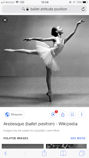
     Describe-      This piece is showing the figure of a dancer. The girl is in the middle of a pose. There is a dark outline near the outside of the figure, which is to define the dancer in the middle of the page. this piece is using graphite and heavy contrast.      Some principals used are spacing in between the girl and the outline to bring the attention to her. There's also movement throughout because the girl in mid-action. Contrast is also very prominent to define the darker parts and in order to create a light source in the piece. I organized this piece by using a simple action so that it was clear what the girl was doing, but still provided an interesting scene. I then created a background with the blended line around her to add detail to the background but not take attention away from her, rather bring attention to her.          The meaning of this piece was to illustrat...

Describing My Photograph

Describe : I made this piece using pencils. I first lightly sketched out the outline of my drawing. Then i went in with an HB pencil and added some darker details. For the black areas in my picture i used a 4B pencil to apply the darkest color. Lastly i took either the lightest pencil; 4H or an eraser and added the highlights and white areas. I think the blending is clearly shown in my piece and i used a blending tool to do it.  Analyze: In my piece i used balance by centering the horse in the middle of the page. I also used movement throughout the fur and fence. Along with emphasis in the dark and bold areas. For the arrangement i considered multiple different positions for the horse. I was influenced by the realism period of art.  Interpretation: There’s meaning in this piece for me because i decided to draw my own horse. I used my own picture and my ideas developed from looking at multiple different pictures. Then comparing them and drawing the best. So, my piece ...

Value Project

Image
Drawing Photo

Artists (Current & Master)

The current artist i chose was Lindsay Bryant. I chose Lindsay because she has many upclose drawings and paintings that i admired for their detail and technique. Especially with her horse paintings. The master artist i chose was Edgar degas. I chose Degas because although he did many pieces on ballerinas i liked the technique and realistic style he would often use. He in fact had a few horse pieces that inspired me to choose the piece i did.